1. Strategy description HTF Candle Profile
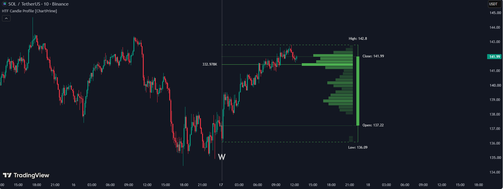
An indicator that builds a Volume Profile chart for exactly one higher-timeframe (HTF) candle currently forming, based on the volume of the current-timeframe bars falling inside it, then projects the whole analysis as a visual diagram right next to the chart.
1.1 Indicator concept
The indicator builds a Volume Profile (a price-by-price volume histogram) for exactly ONE higher-timeframe (HTF, e.g. Weekly) candle currently forming — or the most recently closed one, if the current one is still too "young" (hasn't accumulated the minimum number of bars needed for a reliable read) — based on all the current-timeframe bars (i.e. the chart's own timeframe) that fall inside that HTF candle.
The whole analysis is "projected" as a visual diagram (a synthetic candle + O/H/L/C level lines projected back to real history + a horizontal Volume Profile histogram with a Point of Control) shown right to the right of the current chart, letting the trader see which price zone inside the higher timeframe candle carried the most traded volume — without ever switching timeframes.
1.2 Indicator features
- Synthetic candle: draws a mini-candle representing the HTF candle (a thick Open-Close body line, a thin High-Low wick) at the right edge of the chart.
- O/H/L/C level lines projected back to real history: 4 separate lines (dashed for High/Low, dotted for Open/Close) connecting the real HTF candle's start on the chart to the synthetic candle, with exact numeric labels.
- Volume Profile histogram: a stack of horizontal bars by price zone, each bar's length proportional to the traded volume at that price zone (relative to the highest-volume zone), getting darker as volume increases.
- Point of Control (PoC) line + label: marks the price zone with the HIGHEST traded volume across the whole HTF candle, with a line projected back to real history and a label showing the exact volume number.
- HTF boundary shading: lightly shades the bar where a new HTF period starts + shows the timeframe's short name below the chart at that exact spot.
- Alert: the indicator has NO alert feature — it's purely visual.
1.3 How to use it in trading
- Look at the Volume Profile strip on the right of the chart to quickly identify which price zone within the current HTF candle (e.g. this week) is carrying the most traded volume, without switching to a Weekly chart.
- Use the Point of Control line + label (the longest, darkest bar) as a reference price zone — the zone with the heaviest trading within the HTF period tends to act as a "magnet" that price gravitates back toward, usable as a target or a pullback entry zone.
- Use the O/H/L/C projection lines directly on your lower-timeframe chart as reference support/resistance levels from the higher timeframe (e.g. this week's Open/Close/High/Low) without leaving the chart you're actively trading.
- Only enable the specific levels you need (e.g. just High/Low, off Open/Close) to reduce clutter if you only care about the top/bottom range.
- Change the Timeframe input to whatever suits your style (e.g. Daily if trading on minute charts, Monthly if trading Daily) to get a Volume Profile matching your trading style.
- If a new HTF period just started (e.g. the start of a new week), note that the indicator automatically shows the PREVIOUS (fully completed) period's Volume Profile until the new one has accumulated enough bars (minPeriod) — avoiding a display of a profile that's too young and data-sparse, which could otherwise be misleading.
- Raise "Profile Offset" if you want the whole diagram pushed further from the chart's right edge, to avoid it overlapping the most recent real candles.
1.4 How the indicator works
Inputs & their role
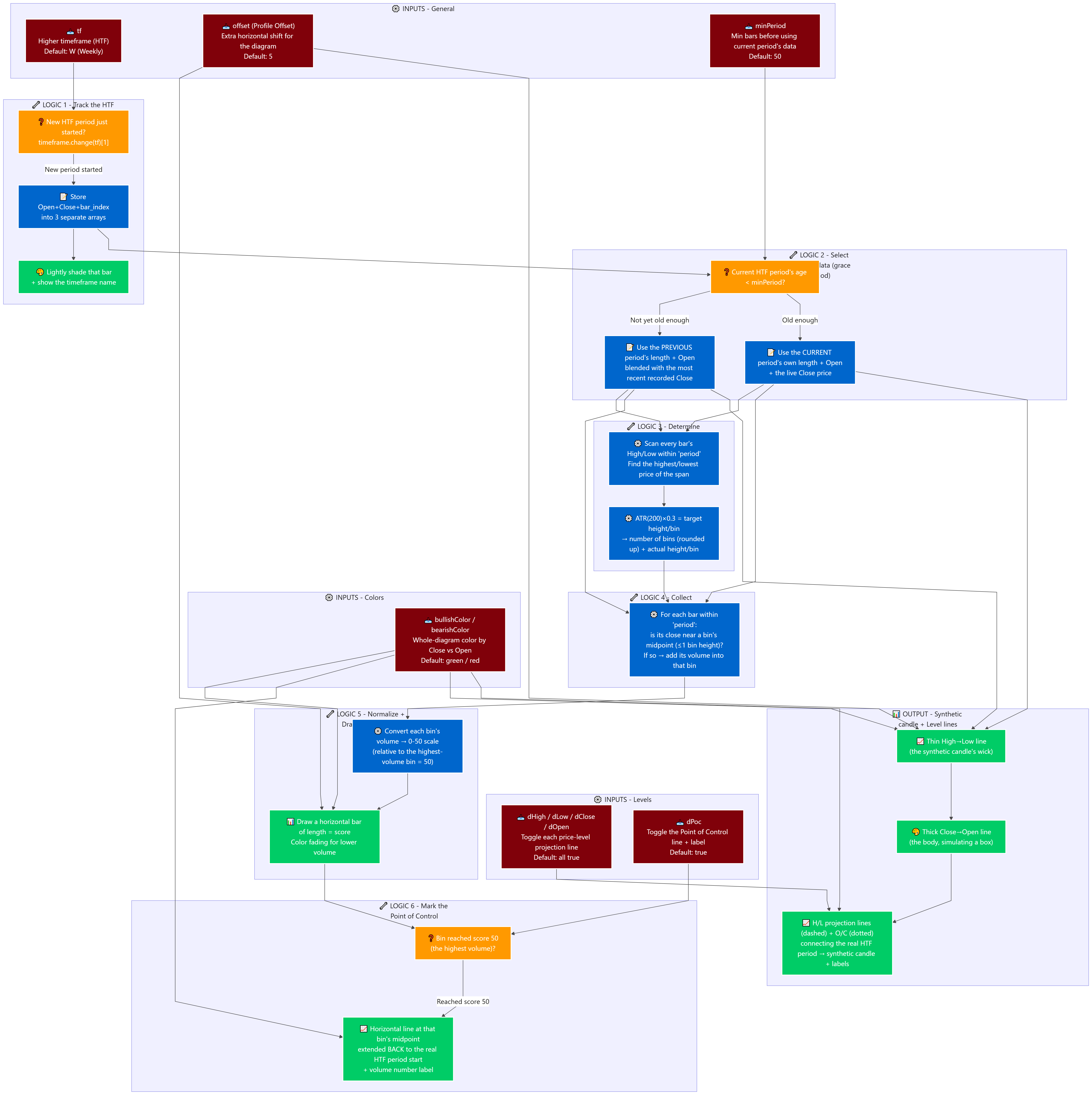
- tf (TimeFrame, default "W" - Weekly, options D/W/M): the LARGER timeframe used to aggregate candles and compute the Volume Profile.
- offset (Profile Offset, default 5): extra horizontal shift added to the entire diagram's position (histogram + synthetic candle), pushing it further from the chart's real right edge.
- minPeriod (Min Period Profile, default 50, min 10): the MINIMUM number of bars that must have elapsed since the current HTF period started before the indicator uses the CURRENT period's data for the profile; if the current period is younger than this threshold (e.g. only 20 bars in, not yet 50), the indicator automatically falls back to the PREVIOUS (fully completed) period's data to ensure enough data, avoiding a profile that's unreliable due to too few samples.
- dHigh / dLow / dClose / dOpen (checkbox, "Levels" group, default all true): individually toggles each High/Low/Close/Open level's projection line + label.
- dPoc (checkbox, default true): toggles the Point of Control projection line + label (the price zone with the highest traded volume).
- bullishColor / bearishColor (color, default ■ green / ■ red): the color used for the ENTIRE diagram (histogram, synthetic candle, every line) — chosen based on Close vs Open of the HTF period being displayed (not separate colors per element).
Main logic blocks
- Working backward from what's displayed: the entire diagram (synthetic candle + level lines + histogram + PoC) is REDRAWN FROM SCRATCH every time the chart's last bar gets a new tick (the code only runs inside the barstate.islast branch) — every redraw wipes all previous drawings first, keeping everything in sync with the latest data.
- HTF boundary tracking layer: every time a new HTF period is detected, the indicator stores the Open + Close price and the bar_index at that exact moment into 3 separate arrays, while also lightly shading that bar and printing the timeframe's short name below it as a visual boundary marker on the main chart.
- Reference-data selection layer (applies the minPeriod grace period): compares the age (in bars) of the current HTF period against the minPeriod threshold — if NOT yet old enough, the indicator "falls back" to using the length + Open price of the PREVIOUS period as the basis for calculation (blended with the most recently recorded Close price), instead of the current period which still has too little data; if it IS old enough, it uses the current period's own length + Open and the live current Close directly.
- Price-range + auto bin-sizing layer: scans every bar within the chosen "period" window (including each bar's high and low) to find the highest/lowest price of the whole span; computes ATR(200)×0.3 as the target height for each price bin, then derives the number of bins needed (rounded up) and the actual height per bin (the price range divided evenly into that many bins) — this makes the bin count self-adapt to market volatility (higher volatility → fewer, taller bins; lower volatility → more, shorter bins).
- Volume-collection-per-bin layer: for each bar within the "period" window, checks whether that bar's close price falls within one bin-height of EACH bin's midpoint (not restricted to a single bin — a close can match several neighboring bins at once if close enough) — if it matches, that bar's volume is added into the matching bin. The result is a total volume figure per price bin.
- Normalize + draw histogram layer: for each bin, converts its volume into a 0-50 score (relative to the single highest-volume bin = 50 points); draws a horizontal bar (box) whose length (in bars) equals that score, extending inward from the histogram area's fixed right edge; the bar's color fades from very faint (low volume) to the full solid color (highest volume).
- Point of Control marking layer: whichever bin reaches exactly a score of 50 (the highest volume) also gets an extra horizontal line drawn at that bin's exact midpoint price, extended from the left edge of that (longest) histogram bar BACK to the real starting position of the HTF period on the main chart, with a label showing the exact volume number at that historical position.
- Synthetic candle + level-line drawing layer: draws one thin High→Low line (the wick) and one thick Close→Open line (the body, simulated as a rectangle via line width) at the diagram's furthest right position; for each enabled High/Low/Close/Open level, draws an additional line (dashed for High/Low, dotted for Close/Open) connecting the real HTF period's start on the main chart to the synthetic candle's exact position, with a numeric label.
Outputs & how they're used
- Volume Profile histogram: a visual read of which price zone within the current HTF period is carrying the most traded volume, without switching timeframes.
- Point of Control line + label: the price reference most likely to "magnetize" price back to it — usable as a target or a pullback-entry zone.
- O/H/L/C projection lines + labels: turns abstract HTF price levels into concrete reference lines directly on the lower-timeframe chart — usable as support/resistance or SL/TP levels from the higher timeframe.
- HTF boundary shading + timeframe label: a quick visual read of where one HTF period ends and the next begins, right on the main chart.