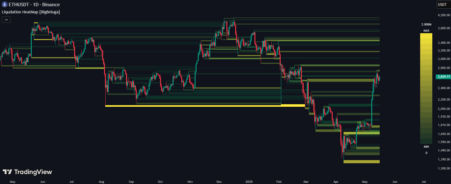
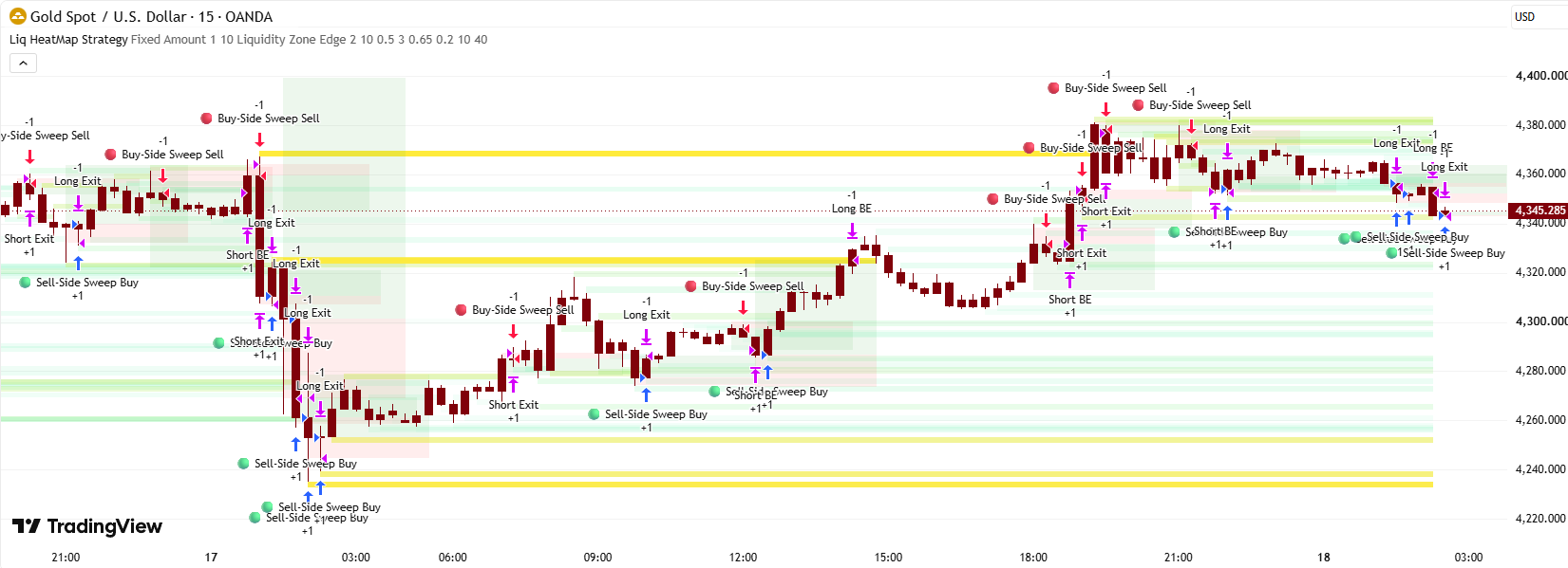
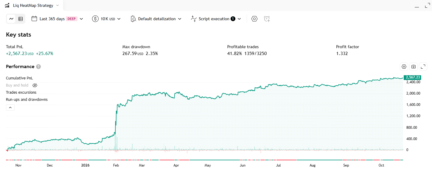
1. Liquidation HeatMap Strategy Description
A "liquidity heat" map: the indicator finds swing highs and swing lows, parks a thin horizontal band right beyond each of them, and shades the band from faint lime to bright yellow according to how much volume traded on the pivot candle. A band stays alive until price cuts through its middle line.
1.1 Indicator Concept
The indicator rests on a very common market idea: stop orders and leveraged positions pile up just beyond obvious swing points. Traders who are short place their stop-losses (which are buy orders) just above a recent swing high; traders who are long place their stop-losses (which are sell orders) just below a recent swing low. Leveraged positions that get wiped out are "liquidated" by the exchange in exactly the same direction. Those clusters of orders are what traders call liquidity pools, and price is often drawn toward them because that is where it is easiest to fill large orders.
The indicator turns that idea into a picture with three simple ingredients:
- WHERE: a pivot. Every swing high or swing low (a candle that is the highest or lowest among the 2 candles on each side of it) is treated as a place where stops are likely to sit.
- HOW BIG: the volume that traded on that pivot candle, compared with the average volume of the last 500 candles. A pivot printed on heavy volume means many positions were opened there, so more stops are probably hiding behind it. That is shown as colour: faint lime for ordinary pivots, shading toward bright yellow for the busiest ones.
- HOW LONG: the zone lives until it is "taken", meaning a later candle reaches the middle of the band. That is the indicator's definition of the liquidity being swept.
An honest caveat: despite the name, the indicator does not read real liquidation data from any exchange. It is an estimate built from price pivots and volume. The author's own listing describes it the same way: a tool that plots horizontal heat zones where potential liquidations and volume clusters may be hiding. Read the bands as "probable stop clusters", not as facts.
1.2 Indicator Features
-
Display:
- Zones ABOVE price (over swing highs): a thin horizontal band whose bottom edge sits exactly on the swing high and whose top edge is one "thickness" higher. This is the estimated buy-stop / short-liquidation pool.
- Zones BELOW price (under swing lows): the mirror image: the band's top edge sits exactly on the swing low and it extends downward. This is the estimated sell-stop / long-liquidation pool.
- The heat colour: every band is filled with a colour between lime (low interest, almost see-through) and yellow (high interest, solid). The same palette is used above and below price, so colour tells you "how hot", never "which direction"; position relative to price tells you the direction.
- Two kinds of bands on screen: a band that runs all the way to the latest candle is still untouched ("alive"). A band that stops partway was cut through at the candle where it stops ("taken"). Both keep the same colour, so the right edge is the only way to tell them apart.
- The scale legend (middle-right of the chart): a narrow vertical colour bar. The top cell is labelled MAX with the largest volume in the last 500 candles (formatted like 142.375K); the bottom cell is labelled MIN with 0. Between them 21 cells fade from yellow down to near-transparent lime.
- Alerts: the indicator has NO alertcondition() calls and NO plot() output. It is purely visual: nothing is exposed that another script or an alert could read.
1.3 How to Use the Indicator
- Treat the bands as magnets and targets. A band above price is a level price may be pulled up toward; a band below is a level price may be pulled down toward. The brighter the yellow, the stronger the pull the author expects. Thick yellow zones are the ones the author suggests focusing on.
- Look for sweep-and-reject setups. The classic way to trade a liquidity pool is to wait for price to wick into the band and then close back out of it. The stops have been triggered, the fuel is gone, and price often reverses. That is a mean-reversion entry: short after a rejected sweep of a band above, long after a rejected sweep of a band below.
- Use alive bands as take-profit targets. If you are long and there is an untouched yellow band above price, it is a natural place to take profit, because that is where your trade is most likely to meet the stops it is hunting.
- Only trust bands that reach the right edge. A band that already stops before the last candle is spent. Ignore it for forward-looking decisions; it is only useful as history ("price swept here and reacted").
- Look for clusters. Several bands piled on top of each other in one price area (equal highs, equal lows, a range edge) mean a bigger pool than any single band suggests.
- Combine with trend and structure. A band in the direction of the prevailing trend is more likely to be a pass-through target; a band against the trend is more likely to be a reversal spot. The author recommends pairing it with trend or structure tools, and on lower timeframes using it to confirm entries around sweeps and deviations.
- Customise the palette to your chart. Only two settings exist (the Max and Min colours). Choose colours that stand out against your candle colours so the hottest bands are the first thing you see.
1.4 How the Indicator Works
Inputs & their role
- max_col (color picker, titled "Max", default yellow, group "Liquidation Color", shares one row with Min): the colour of the hottest bands, i.e. pivots that printed volume at the top of the recent range. It is also the top colour of the legend. Example: change it to red and the busiest zones turn red while ordinary ones are untouched. Because it is used as-is (not made transparent in code), a fully opaque pick makes hot bands solid.
- min_col (color picker, titled "Min", default lime, same group and row): the colour of ordinary bands. Internally it is made 90% transparent before use, so weak bands look like a faint wash. Example: change it to blue and average pivots appear as a faint blue wash. Since it is already 90% transparent, even a bright colour stays subtle.
These are the only two adjustable settings. Everything else is hard-coded, listed next.
Hard-coded constants (NOT inputs)
- bars_amount = 500: used for three things at once. The size of the rolling volume window, the number of recent candles in which zones are created and tracked (anything older gets nothing), and the initial size of the zone array.
- index = 2: the pivot strength. A pivot needs 2 candles on the left and 2 on the right to be confirmed, so a pivot is always known 2 candles late. It is also the shift used to look back at the pivot candle's price, volume and ATR.
- ta.atr(200) × a timeframe multiplier: the thickness of every band. Multiplier by timeframe: 0.2 on any chart of 60 minutes or longer (1H, 4H…) and on Daily; 0.25 on 1 to 59 minute charts; 0.4 on everything else (Weekly, Monthly, seconds, ticks).
- The gradient breakpoints: colour opacity 90 for the faint lime end, and the 500-candle average volume as the midpoint between "weak" and "strong".
- The legend: 23 rows (rows 0 and 22 hold the MAX / MIN text, rows 1 to 21 are colour cells), table placed at position.middle_right, small text.
- max_boxes_count = 500 and max_bars_back = 500: the drawable-box ceiling and the history buffer.
Main logic blocks
📊 Flow 1: The rolling volume window (the volume_data function, every candle)
- The function keeps a list (an array: an ordered list of numbers) of exactly 500 values, one per recent candle. Every new candle, its value is added at the end and the oldest value is dropped from the front. So the list is always "the last 500 candles".
- What value is stored: the candle's volume. There is a fallback: if cumulative volume is 1 or less (the symbol provides no volume), it stores (high − low) × 100 instead, which is the candle's size scaled up. This keeps the colour logic alive on symbols without volume.
- From this list the indicator later reads two numbers: its average and its maximum. These two numbers are the yardsticks for colour.
📍 Flow 2: Finding pivots and band thickness (the detect_liquidity method, every candle)
- ph = ta.pivothigh(2, 2) and pl = ta.pivotlow(2, 2): a swing high is a candle whose high is above the highs of the 2 candles before it and the 2 after it; a swing low is the same on the low side. The result only appears 2 candles after the pivot (once the right-hand candles exist) and holds the pivot's price.
- atr = (ta.atr(200) × multiplier)[2]: the average candle range over 200 candles, scaled by the timeframe multiplier, then read as it was 2 candles ago so it lines up with the pivot candle. Example: on a 15-minute XAUUSD chart with ATR(200) = 4.00, the multiplier is 0.25, so every band is 1.00 thick.
- vol_value = vol.last()[2]: the volume of the pivot candle (the last item of the list, read 2 candles back).
🌈 Flow 3: Choosing the heat colour
- The colour comes in two segments, split at the 500-candle average volume. At or below average: blend from fully clear up to 90%-transparent lime, so below-average pivots are barely visible. Above average: blend from 90%-transparent lime up to the full Max colour (yellow), reaching the full colour at the 500-candle maximum.
- Example: average volume = 1,200 and maximum = 6,000. A pivot candle with volume 600 → half-way up the first segment, nearly clear. Volume 1,200 → faint lime. Volume 3,600 → exactly 50% of the way from average to maximum, so a 50/50 mix of faint lime and yellow. Volume 6,000 → pure yellow.
- The colour is frozen at the moment the band is created. It is never recalculated afterwards, even though the 500-candle statistics keep moving.
🧱 Flow 4: Creating the bands (only inside the last 500 candles)
- The gate: (last_bar_index − bar_index) < 500. Only the most recent 500 candles of the chart run the creation and tracking code. Older candles produce nothing, which is why the left part of a long chart is empty.
- Zone above a swing high: a box from the pivot candle (bar_index[2]) to the current candle, with bottom = pivot high and top = pivot high + atr. No border, filled with the heat colour. Example: pivot high 2,650.00 and thickness 1.00 → band 2,650.00 to 2,651.00.
- Zone below a swing low: a box with top = pivot low and bottom = pivot low − atr. Example: pivot low 2,630.00 → band 2,629.00 to 2,630.00.
- The trigger condition is written as "ph now, OR ph 1 candle ago, OR ph 2 candles ago". That means one pivot fires the creation code on three consecutive candles, so every pivot spawns up to 3 stacked bands instead of one. See the notes below for what this does.
🔍 Flow 5: Tracking and "taking" the bands (every candle, inside the same gate)
- All live bands are kept in a second list (liquid_zones). On every candle the code loops through that list.
- Stretch: each band's right edge is moved to the current candle, so live bands always run up to the latest candle.
- Middle line test: mid = (top + bottom) / 2. If the current candle satisfies high > mid AND low < mid (its range crosses the middle line, wicks included), the band is taken: it is removed from the list. Because it is no longer stretched, its right edge stays frozen at that candle, and the box remains drawn.
- Example: the band 2,650.00 to 2,651.00 has its middle at 2,650.50. A later candle with high 2,652.00 and low 2,649.20 crosses 2,650.50 → band taken, its right edge freezes there. A candle that only touches 2,650.20 does not take it (it never reached the middle line).
📏 Flow 6: The scale legend (the draw_scale function, last candle only)
- Runs only on the last candle (barstate.islast) and builds a small table at the middle-right of the chart.
- Row 0 shows the 500-candle maximum volume plus the word MAX; row 22 shows MIN and 0 (the minimum is hard-coded to zero, it is not the real minimum). Rows 1 to 21 are colour cells that blend evenly from faint lime to the Max colour.
Outputs & their role in trading
- Alive bands above price: estimated buy-stop / short-liquidation pools, used as upside magnets, take-profit targets for longs, and sweep-and-reject short areas.
- Alive bands below price: estimated sell-stop / long-liquidation pools, used as downside magnets, take-profit targets for shorts, and sweep-and-reject long areas.
- Taken bands (frozen right edge): a record of where price already swept liquidity and how long the band survived. Useful as context, not as a forward-looking level.
- Colour intensity: the relative importance of each band. Reading it correctly requires the technical notes below.
- The legend: a quick key to what "yellow" means in volume terms on the current chart.
- The zones are an ESTIMATE, not real liquidation data. Nothing in the code touches exchange liquidation or open-interest data. A zone is just "pivot + a slice of ATR + volume of one candle". Two pivots with the same volume get the same colour whether or not any real stops sit behind them.
- Every pivot creates UP TO THREE bands, not one. Because the condition is not na(ph) or not na(ph[1]) or not na(ph[2]), the creation code fires on the pivot's confirmation candle and on the next two candles as well. The 1st band is anchored on the real pivot. The 2nd and 3rd are anchored on the highs (or lows) of the two candles after the pivot, which are not pivots. They land at almost the same price, so they stack into what looks like one slightly thicker, slightly more opaque band. Consequences: the box count is roughly three times what a one-per-pivot design would use, and the 2nd/3rd copies use different volume and ATR readings, so their colours differ slightly.
- The 500-box ceiling shortens the visible history. On a random-looking price series about 2 candles in 5 are a swing high or low, so with 3 boxes per pivot the chart produces on the order of one box per candle. The 500-box cap is therefore reached well before the 500-candle window ends (a rough estimate: around 400 candles back). Pine silently deletes the oldest boxes beyond the cap, so the far-left zones disappear on their own.
- "Taken" means a wick reached the MIDDLE line, nothing more. There is no close-based test. A one-tick wick that crosses the middle takes the band even if price immediately snaps back, which fits the idea of a liquidity sweep but also means the band disappears on noise. The opposite also holds: if price gaps over the whole band (the candle's low is already above the middle line), the test low < mid fails and the band is not taken. It keeps stretching to the right while price sits on the far side of it, and only gets taken if a later candle's range straddles the middle line.
- Taken bands look exactly like alive bands. The colour is never changed after creation, and the box is not deleted when it is taken. The only visual clue is where the right edge stops. On a crowded chart it is easy to mistake an old, spent band for a live one.
- There is no memory outside the last 500 candles, and the logic lives inside a function. The list of live zones (liquid_zones) is declared inside the detect_liquidity method, so no other part of the script can read it. This matters for Phase B: a strategy cannot just "read the indicator's zones". It must recompute an equivalent set of pivots and zones on its own, using the same formulas. The indicator also exposes no plots and no alerts to hook into.
- Colour is relative, frozen, and based on ONE candle. It reflects the pivot candle's volume against the 500-candle average and maximum at the time of creation. A yellow band from 400 candles ago was judged against a different window than a yellow band from today, and colours should not be compared across symbols or timeframes. It also says nothing about how much volume traded at the level in total, only about one candle, and nothing about whether that volume was buying or selling.
- The legend is only an approximation of the colouring. The legend blends evenly from faint lime to yellow in 21 steps. The real band colour uses two segments split at the average volume, so the legend's middle cell is not "average volume". The legend's MIN is always 0.
- Zones appear 2 candles late, with a back-dated left edge. A pivot needs 2 candles on its right to be confirmed. The band is drawn at confirmation time but starts at the pivot candle, so on a live chart you can never act on a band before it is 2 candles old. This is not repainting: once drawn, the band is not moved.
- Thickness depends on the timeframe through a hard-coded table. Switching between 45-minute and 60-minute charts changes the multiplier from 0.25 to 0.2, so band thickness jumps for reasons unrelated to the market. Anything built on these zones inherits that quirk.
- The list starts with 500 empty slots. The zone list is created with 500 empty (na) items that are never removed, so the per-candle loop walks 500 or more entries even when few real bands exist. The empty slots do nothing harmful (the middle-line test on an empty item is never true), but they are wasted work.
- Minor code oddities that do not change results. The line box_id.set_right(bar_index) inside the middle-line test repeats what the loop already did. The legend table is created with 100 rows but only 23 are used. The function parameters are named min and max, which shadow Pine's built-in functions of the same name inside draw_scale.
- The two colour inputs share a single row. In the Settings dialog you see one row titled "Liquidation Color" with two swatches labelled Max (first) and Min (second).